Major Exit Node Improvements
 Alex
2026-08-27
Alex
2026-08-27Over the course of Exit Node's development, the biggest hurdle wasn't learning game dev, it was learning how to combat Unity's editor limitations.
DIALOGUE UI
First things first, new dialogue UI. The core UI motif for Exit Node has always been the grunge torn magazine aesthetic, and thankfully I've been happy with the results. For the first iteration, the game was intended to lean far heavier into dialogue. I took a lot of the methodology from games like Disco Elysium and Planescape Torment for their dialogue structure. It's definitely a classic and time-tested design strategy:
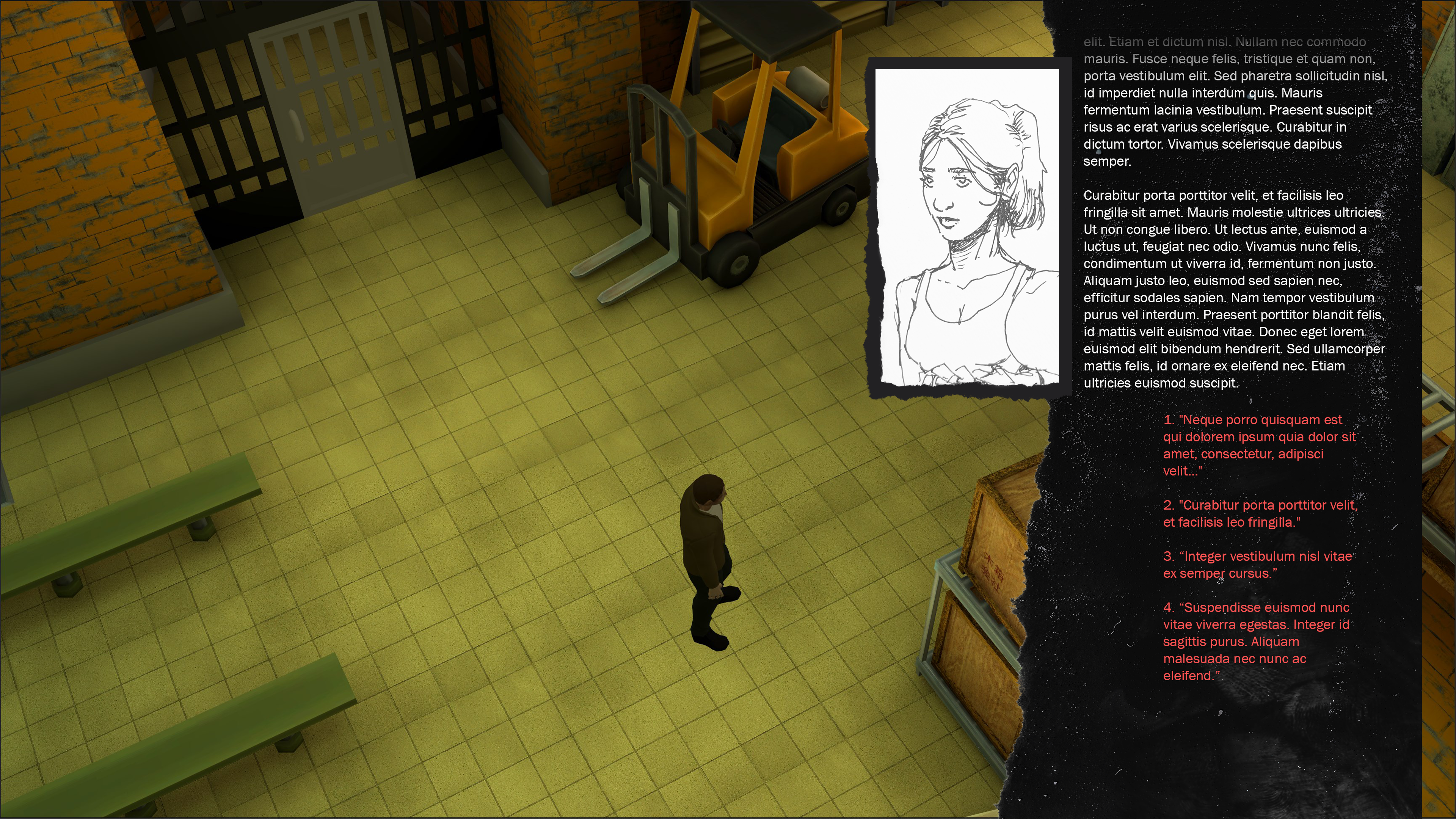
But as time passed, I couldn't shake the feeling that it just wasn't a good fit for this game. For one, I'm a terrible writer. This game already has a lot of dialogue written out, but when I start to introduce the hurdles of the mountainous branching dialogue tree's and diverging story paths I'd originally planned for, I realized (after far too long) that I'm dragging a lead weight behind me for no real gain.
I decided to scale back. Focus on making each scene a bit more digestible, but for the betterment of the story. Now with a scaled down scope, I can better focus on where to improve the story, how to deliver lines, how to better structure a scene, and can even better solve where I can split dialogues into different directions without introducing overly complex webs of text.
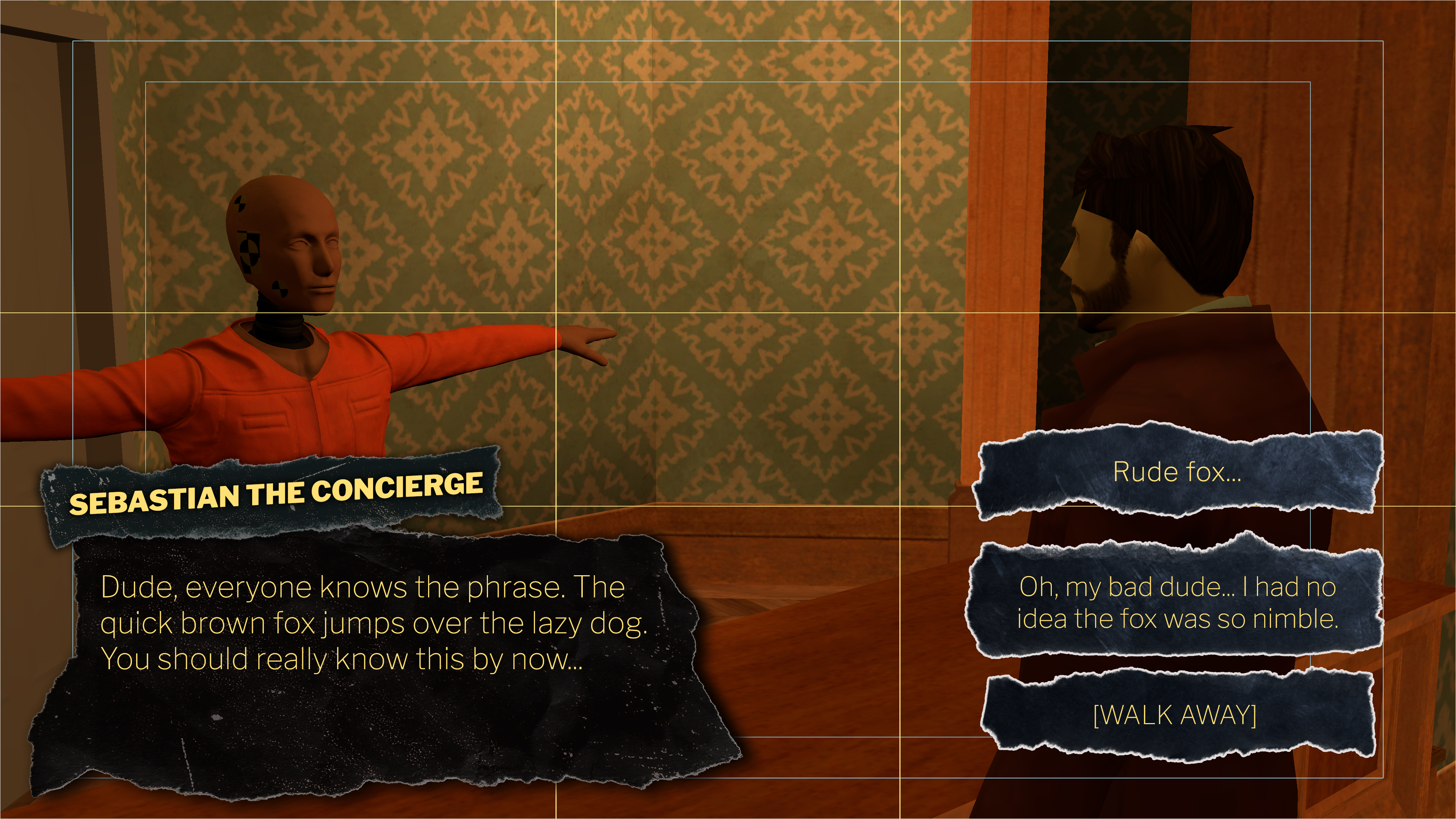
So, the new strategy warranted a scaled down UI. I simplified it, and have been much happier with the results. With this simpler and snappier dialogue, reading what the character is saying is digested much faster, and provides a more comfortable experience:
CAMERA OVERLAYS
While we're looking at Sebatian, I'll mention how tedious it is to properly frame up every camera off of vibes alone.
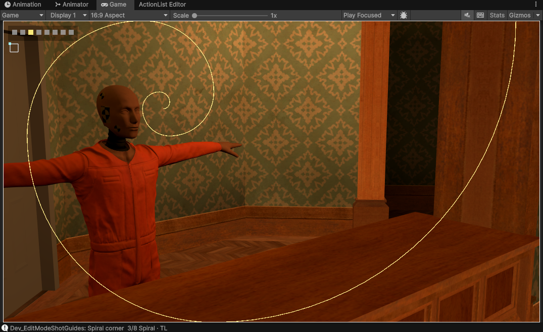
I was dropping cameras into the scene, placing them wherever felt natural, and framing up a shot entirely off of intuition. I'm sure most of anyone has that innate sense of rule of thirds and all that mumbo-jumbo without even realizing, but I wanted to double check I wasn't crazy and setup some overlay tools for both runtime AND in edit mode.
And after some custom tooling and hooking into the unity graphics library, we have runtime overlays that can be toggled on/off with F10, orientation of the spiral with Ctrl+F10, and Shift+F10 cycles through the different frames:
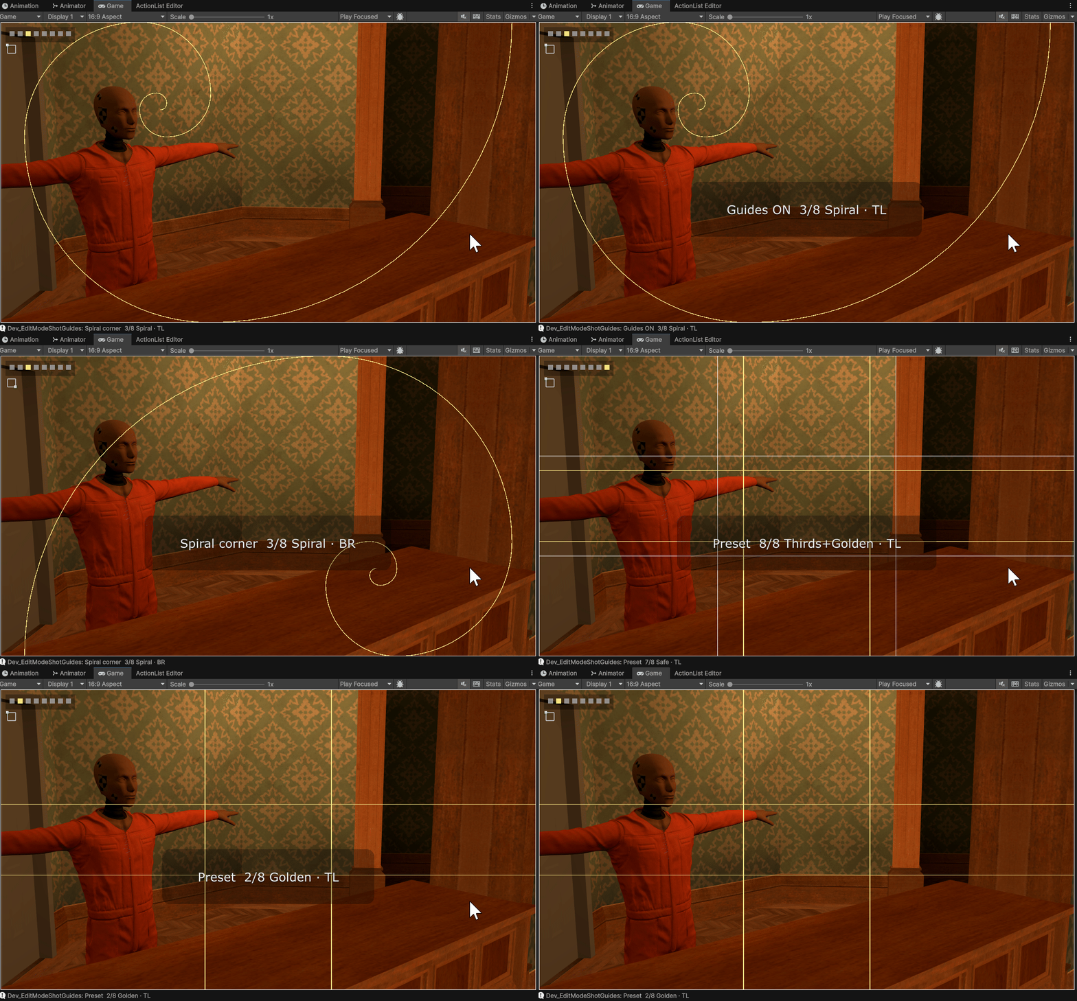
And during runtime just using standard ImGUI tools, I have a debug window that gives me similar options, but with a screenshot capturing tool to export the game camera's backbuffer directly to a PNG. A bit of an oversimplified explanation, but very helpful for when you need to have a background image to mock up UI elements on top of.
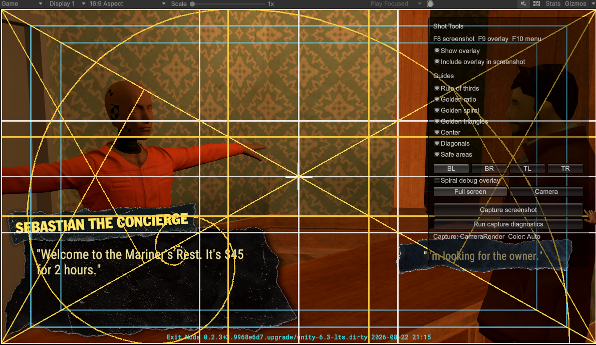
(Toggling all overlays is helpful when you want a headache)
MAIN CHARACTER UPGRADE
Another major improvement was to the player character's model.
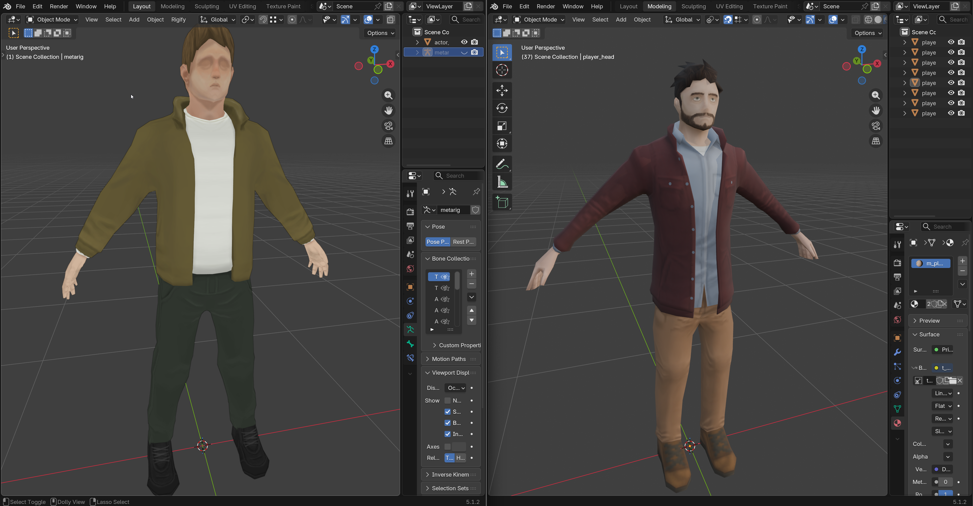
The first draft of the player character (left) was after learning the whole "modern" workflow of sculpting a high-poly character, retopoligizing him, and then UV and texture paint work. This took forever but was good info to learn.
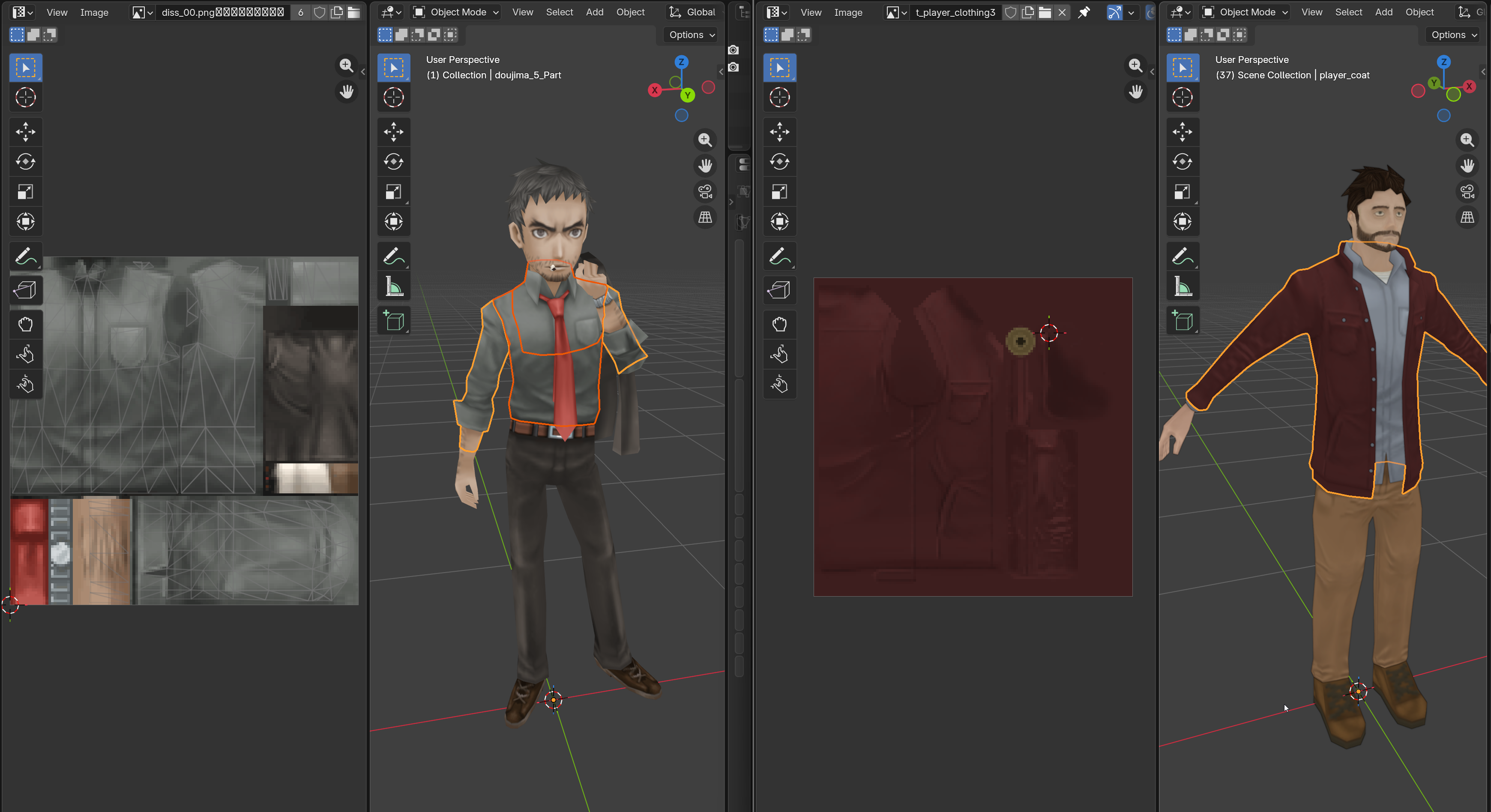
I was much happier with my second draft. Not only with the final result, but the entire workflow was more enjoyable and faster. I started by extracting and analyzing models from older japanese games (Persona 4 Golden for example). I studied a few characters, but mainly noticed how they utilized geometry and texture mapping to piece together the full character.
Let's look at Dojima from P4:
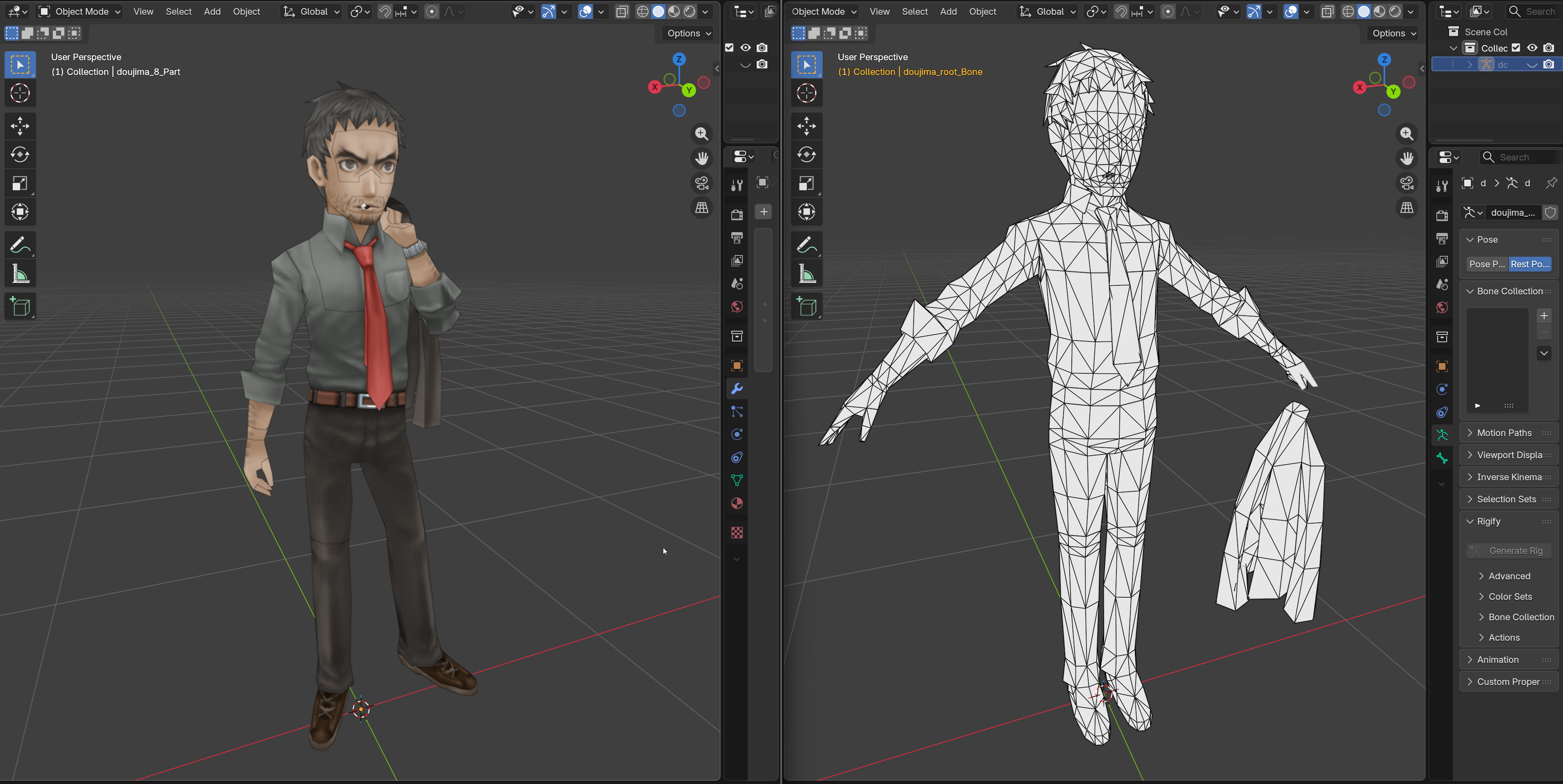
As is common amongst a lot of these older games, all the detail is obviously packed into the textures instead of geometry, but it was interesting to see how they'd stretch out a few triangles on the head and make a believable tuft of hair, or how they triangulated certain parts around the waistline knees, and shoes to reach this balance of a clean mesh that's still easy to UV and texture. These older games also use the UV shift strategy where they switch between different emotions by just moving the UVs programmatically at runtime:
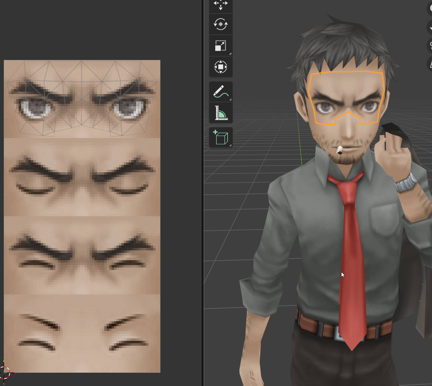
I haven't yet implemented other emotions for my character, but definitely have added it to the 'todo' list.
And regarding textures, I followed a similar method. This usually always requires different approaches that work best for each character, but you can see how I make sure to paint enough "light" into the texture to make the whole coat look interesting. No matter what light situation the player will be in in-game, I paint enough lighter highlights towards the top/shoulders of the coat, and on top of where wrinkles/folds would catch that same light. I follow this same methodology through each texture and piece of clothing.
Now I know it's worth considering optimization. A tricky subject that shouldn't be ignored, but I did weigh the benefits of whether or not I should attempt to pack as much of the character into as few materials/textures as possible, but ultimately I decided that was unimportant. The cost of the additional draw calls for the 6 materials the player uses is negligible compared to the added friction it would add to the painting/modeling/rigging aspects of the actual creation pipeline. Naturally this doesn't apply for something environmental for example, but for something that's as important the player character which is always on screen, the impact doesn't budge the FPS counter at all. This is of course a more technical subject that warrants some nuance, but it summarizes my design decisions.
ENVIRONMENT UPDATES
My favorite part of game dev is environment design. Am I good at it? Decisively no. Do I love doing it anyway? Absolutely.
For the historic district scene, which is one of the hub scenes within the city, we find a few locations like the Mariner's Rest hotel and the Cathedral of St. Christopher (working titles).
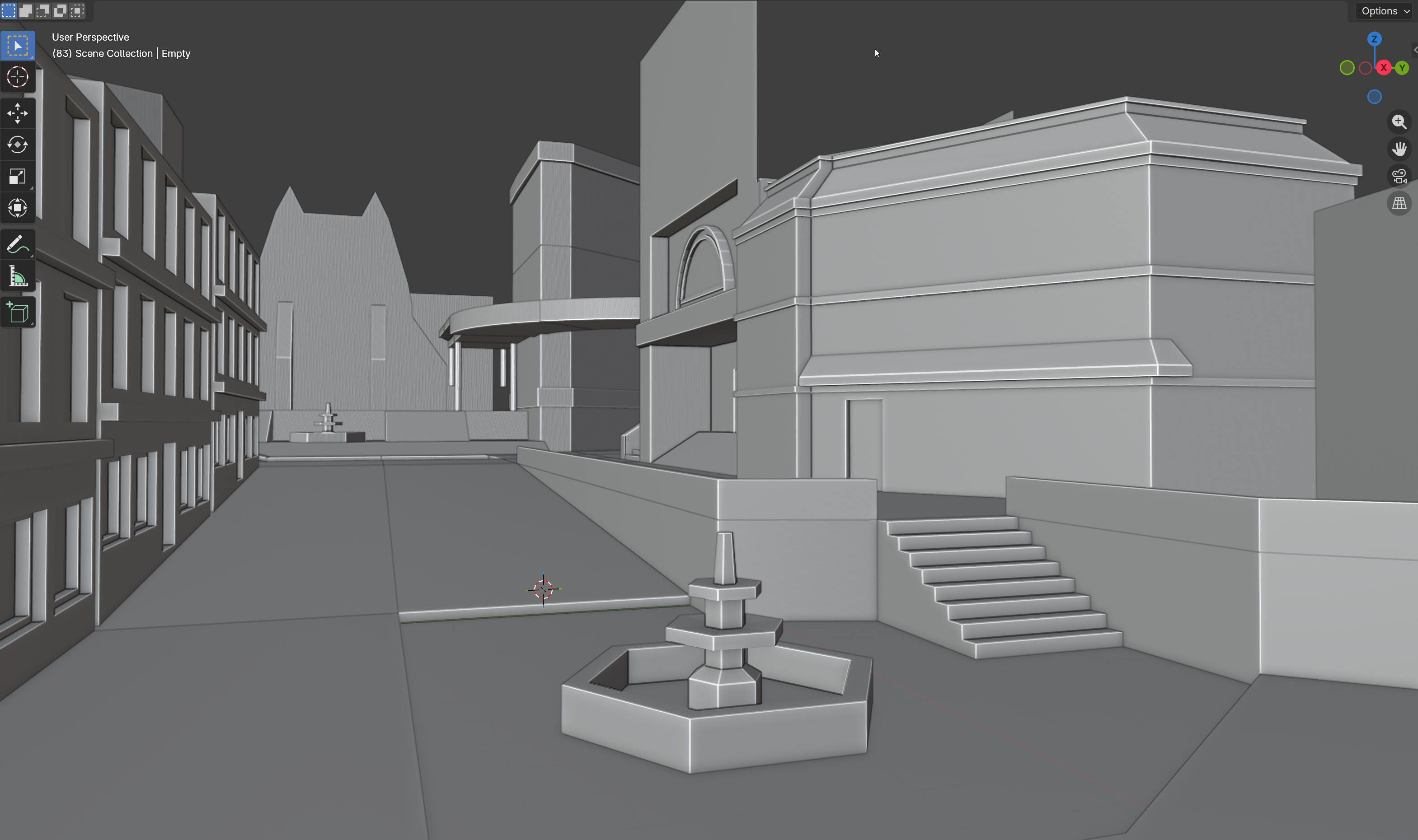
In this initial blockout design I wanted to go for something that captures the important locations right in the heaviest locations of the shot. The cathedral at the end of the street, where the shot wants to draw you into this prominent structure indicating it's power over the neighborhood. And on the right, the hotel. A historic and well respected hotel, struggling to keep up with modern times.
But the more I started implementing more interactive elements into the scene for the player, it started to feel wrong. The general shape was cool, but it was fighting me more than benefiting me. So I tried blocking out a new iteration from scratch:
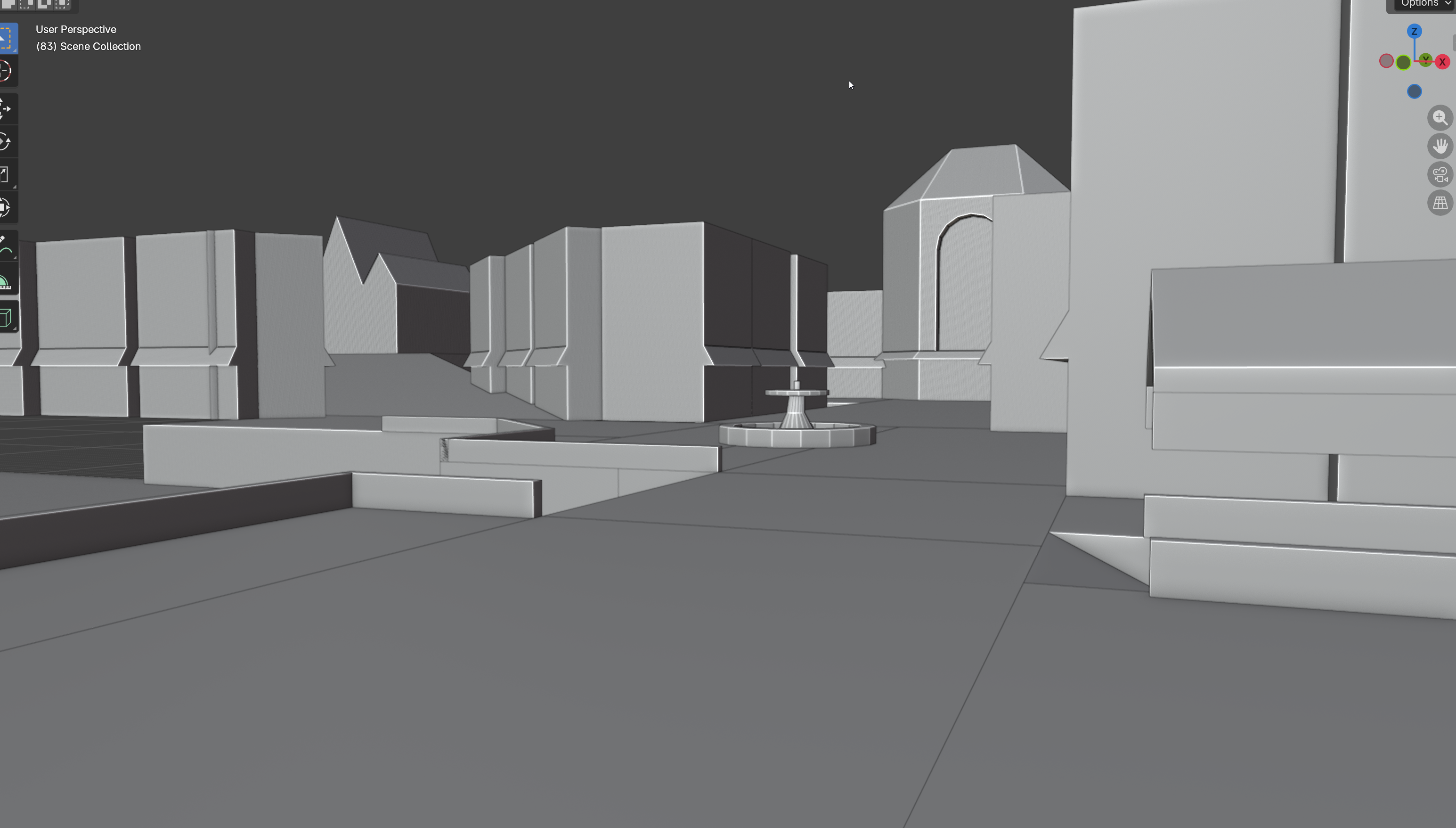
It's definitely uglier so far, and lacks any verticality or interesting aspects, but the overall shape for player movement feels less restrictive while still providing 'more' information in one shot. It's a bit hard to explain, but basically at a comfortable tracking distance of the player, we can show more buildings and details in the shot than I was able to with the previous layout.
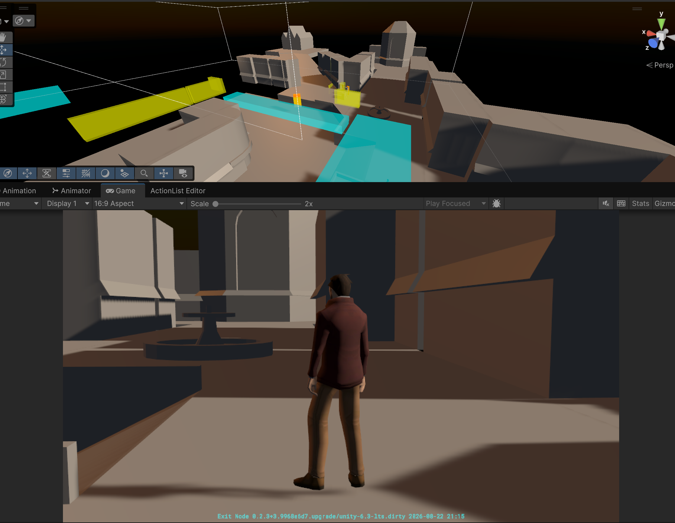
There's at least 5 store fronts visible from this one game view... dope
To hopefully better explain, I followed a similar design for another district scene "Portside". Here's some scene view shots at first to show the picture:
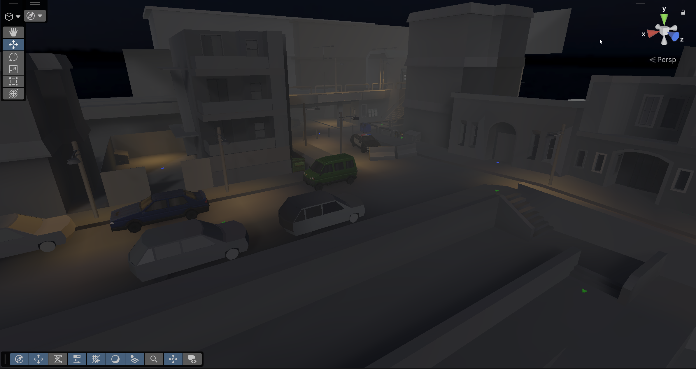
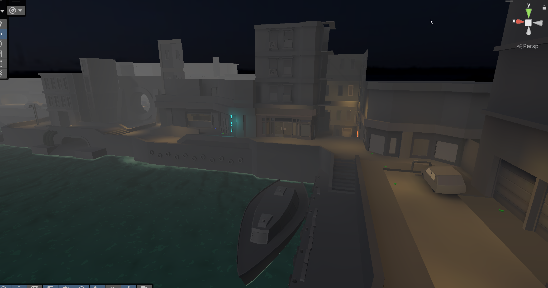
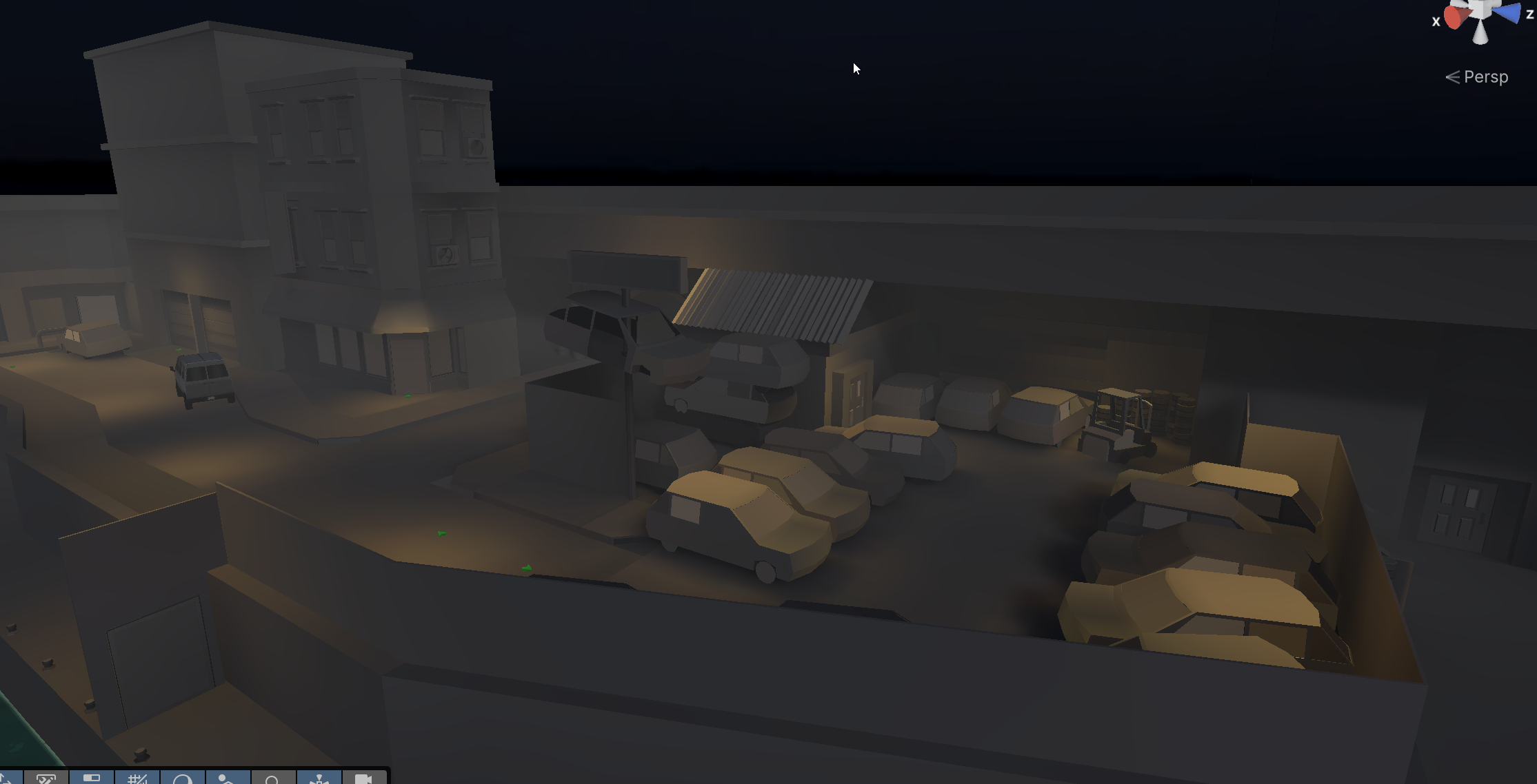
And with this set dressing approach, I can still get away with creative camera angles in tighter areas, while the overall traversal cameras get bound to a tight box that can follow along with the player like this:
Now all of this is of course very early environment development stages. These are just massive blender export projects where I have some fun mocking up areas and popping back and forth between blender and unity to test the overall distance and feel it gives the player. I test how a camera might work in a certain area, or how a light might cast a shadow. Once I'm happy with it (probably hundreds of movies watched on the other screen while during the modeling), I start using this blockout for actual game content. Placing triggers and mission logic, NPCs, etc. Testing until I know nothing about the shape needs to change. Only once I'm happy with the shape of the environment, then I will begin to model out the "final/textured" individual elements, buildings, structures, props, etc. I prefer a blend between a modular approach with a few bespoke elements that tie the scene together.
CUSTOM SCENE NAVIGATOR
One final small tool that has been my absolutely most used tool for this project is a custom designed Scene Navigation panel I can dock in my editor for faster hopping between scenes.
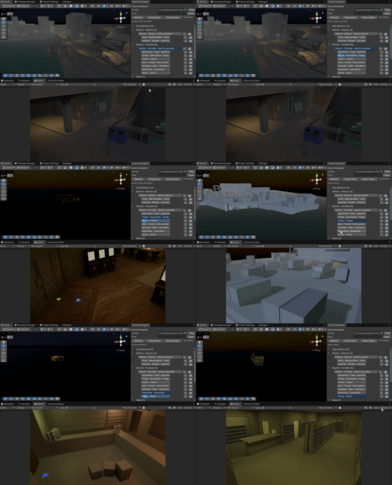
Development at almost every single step for a game like this requires constant flipping between scenes. And the Unity project navigator is one of the most cumbersome and high-friction aspects of this. No longer do I need to navigate a folder tree to find my scenes. A list of buttons should be able to do it for me. A few other quality of life buttons like pinging the scene asset, copying the scene name to the clip board, and a config file where I can define the scene relationships (for the mapping of what button goes where on the list), and logic that just dumps any new scene to the bottom of the list makes this thing one of my most used panels. If you don't have something similar in your project, I highly recommend it. I'll even give you the code if you ask.
I think that covers all of the major improvements over the past few weeks. This has been a well loved project that's constantly morphing into something else, but it's coming along one step at a time.
Comments
Sign in to comment.
No comments yet.